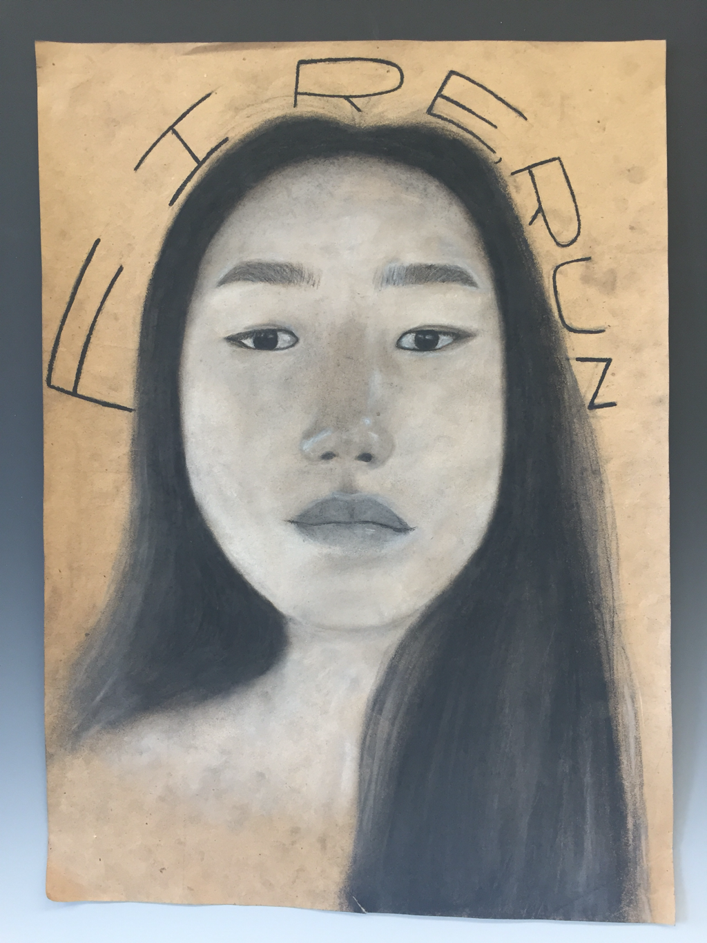
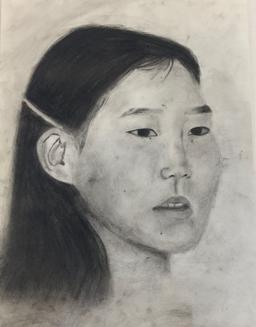
Piece 1: self portrait
During this piece, I was able explore some different techniques. I tried blending the charcoal with my finger and a blending stump although neither were completely mastered, I am able to gain further knowledge on the uses of charcoal for future reference. I also experimented with white charcoal, compressed charcoal, and creating value with an erasure. I was able to successfully use the compressed charcoal for my hair although using the erasure proved to be difficult. I also was able to use white charcoal, but I used too much for my whole face which washed it out.
I was able to gain inspiration from many of my peers and my teacher. I saw how many of my peers drew their hair in which I took inspiration from. When researching Jean-Michel Basquiat, I gained insight into the Neo-expressionism movement and the culture identity behind his works. I chose him because his the aesthetic of his artwork really caught my attention and I really loved his use of text in his work which I was able to translate into my art.
I first started with a sketch of my face and worked from there. I then started adding more detail to my eyes and nose in which I later sketched out my lips and eyebrows. After completing a willow charcoal sketch of my facial features I added in my hair. Then I went back with permanent charcoal and white charcoal to solidify everything. Lastly I added my text in charcoal.
If I could redo this piece I would start by getting my face shape correct. In my drawing my cheeks are too full and my forehead is too small. I would also add shadow in my neck as it looks unfinished and I would make my left eye slightly larger. I would do this in order to make this drawing look more like me.
This piece relates to my onion drawing as charcoal medium was used in both. It also relates to my onion drawing and black out poetry because both focus on value and contrast between black and white.
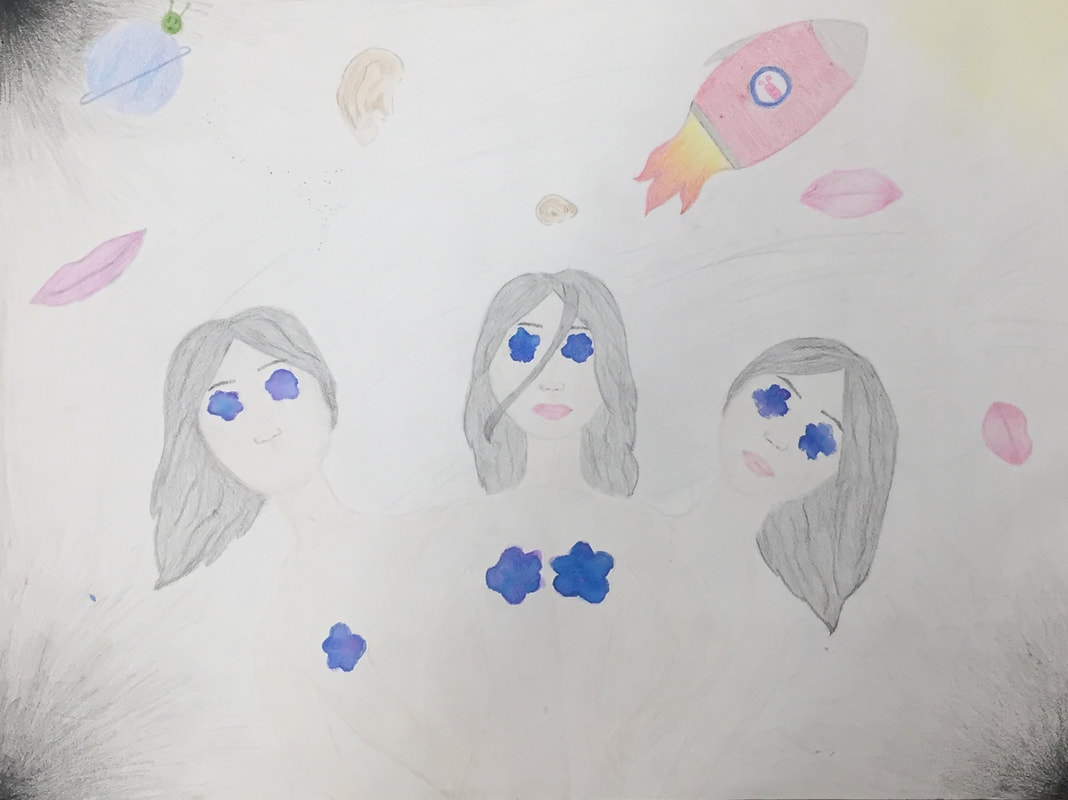
Piece 2: required social issue
In this piece of art I attempted to use techniques of shading and pressure in order to create different values within the art. The lips and ears floating in space were able to exemplify my use of these techniques but the girl's hair and skin tone proved to be difficult to master.
I was able to draw inspiration from artists by tuning into to a less real looking art piece and explore something with more ambiguity and cartoon-like features. Jean-Michel Basquiat mostly created art that wasn't real looking, but more of a loose, abstract interpretation. Through this I was able to think outside of the box and create something that wasn't real-looking. I chose Jean-Michel Basquiat because all of his artwork has a hidden meaning behind it. As this was my social issue piece, I was able to gain insight and tune into my race and its culture, just as Basquiat did, in order to create a piece with historical meaning.
I first started this piece by drawing the three girls. I knew I needed three girls in the middle of the piece and be to the central focus which is why I placed them in the middle. I also purposefully decided to draw on of them without a mouth. I then knew that I needed to draw mouths and ears floating in space so in order to do this, I drew them in different positions and places to create a floating look. I then drew the rocket ship heading toward the only bright corner and the little planet with an alien on it. After coloring this, I decided I wanted to girls to not have eyes but to have flowers for eyes instead. I created these flowers with water color and glued them over my original piece of paper. This added texture and dominance.
If I could do this piece over, I would have chosen a different medium. I used colored pencils, but now looking back at my piece I wish I would've used a paint. I believe this would have created more contrast while also getting the cartoon-like look across more efficiently.
This piece relates back to my self portrait piece because I continued to forge my use of value and composition. In addition because this was my social issue piece, I was able to tune into my race and culture in order to draw Asian like features. I also introduced the theme of aliens and space in this piece.
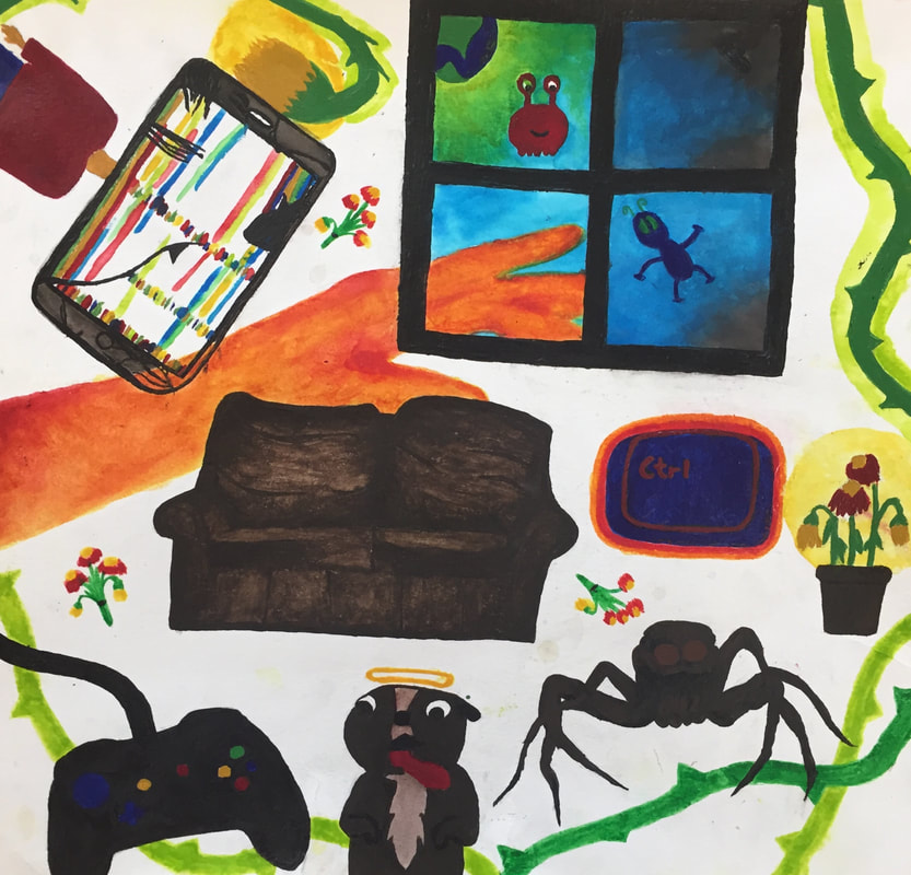
Piece 3: not required childhood to adulthood
I attempted to demonstrate value and dominance within my piece by using many different colors that contrasted with each other. I struggled with creating very distinct and clean lines because my drawing was fairly small and my brush was pretty large. Although I struggled with this, I was able to perfect my use of combining two mediums: acrylic paint and water colors to create interesting values and dynamics.
I was able to derive inspiration from Jean-Michel Basquiat as he used many primary colors and his composition was usually not centered and free. I used Basquiat because I love the simplicity of his artwork while it also leaves the audience confused and up for interpretation while also maintaining unity.
I starting with creating a flow chart and formulating my ideas into pictures. I thought of what my future looked like and choose images based on my emotions toward my future. The couch symbolizes my comfortable life right now and the worn in use of it exemplifies how long I have lived with the things I know. Every other object and part of this artwork symbolizes another emotion and element. Sticking to my theme of space and aliens, I used composition that would support the idea of floating in space. I also decided fill up a lot of space in this piece in order for it to be crowded so the audience would be overwhelmed and confused, another emotion I wanted to portray.
If I were to redo this piece, I would not have drawn a window, but a circle opening to the world outside. I don't like the way that it looks and I wasn't able to achieve the aesthetic I was going for.
The common theme within my pieces are the ideas of space, aliens, and the unknown. This ties with piece one as aliens were present and space was the setting of the first piece.
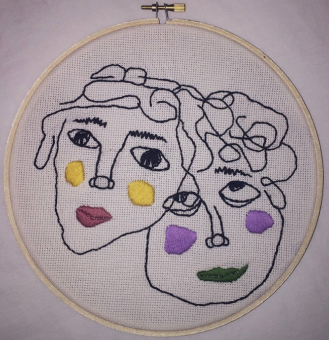
Piece 4: required no experience needed
While creating this piece I explored several techniques. The first technique I explored was dominance as the faces were layered on top of each other in my initial stencil of the piece. The boy's eye takes dominance over the girl's face, although in all the girl's face dominates over the boys. These pieces exercised unity as they both had repeating elements within them. To create this unity I used a back stitch which formed a solid line. The back stitching technique was relatively simple and after a couple of attempts I was able to mater this stitch. The next stitch used was a satin stitch. This stitch creates the cheeks and lips of the characters. I struggled with this stitch when creating the lips as the fabric underneath was visible despite my attempts to correct this. Otherwise, I was able to master the satin stitch on the cheeks.
I derived inspiration from artist Jenny Hart as she has made many amazing pieces. I decided to use her art as a rough guide for mine while changing it up by adding more abstract components whereas Hart's work is realistic. I gained meaning from her work as she incorporates social injustice into her pieces. I chose Jenny Hart because as I was searching for inspiration, her piece "Dirty Face" caught my eye and I got very inspired by it.
I first started this piece by sketching the faces out on a piece of paper. I originally was going to embroider just the girl, but on a whim I drew the boy and I liked the way it turned out. I drew loosely to create more abstract features. I then cut the faces out and positioned them behind the embroidery fabric. I then used a pencil to trace my design onto the fabric. After this, I started with the black stitching and completed the hair and face outlines. I then did the cheeks and lips and finished with the nose, eyes, and eyebrows.
If I were to do this piece again, I would redo the boy's lips because I don't like the way they turned out. The fabric underneath stuck out too much and it looked messier than I intended. I would clean this up so create a smoother, more finished look.
In my previous pieces I stuck to a theme of aliens and space, and in this piece I decided to take a different approach. Instead of creating an alien that was created in fantasy and took the form of what is commonly tied to the word alien, I decided to put these alien-like features within people. The faces I created resemble humans, although they look unrealistic and abstract. I used unrealistic colors for the cheeks and lips and their facial features are not drawn realistically either. In these subtle ways, I was able to connect this piece to my overall them of aliens and space.
Piece 5: not required
In my second attempt at using charcoal I was able to work on previous skills that I learned while correcting mistakes I made in the past. I think during this piece I improved on placement and the facial features, but I continued to struggle with blending the charcoal, and therefore my values were off. I wasn't able to create the gradients that I was attempting to accomplish. I especially struggled with the cheek contouring and the different values within the hair. Within this drawing I exemplified different values as I had to blend and match the values within the picture to my art. Next, I had to work with shapes, sizes, and space when determining the placement of the facial features.
I gained inspiration from a black and white picture of my aunt. In addition I looked up charcoal portraits to gain more inspiration and references. In this piece I decided to let myself have more freedom, so I didn't restrain myself by closely following someone else's piece. I used some techniques from my previous charcoal piece as well.
I started with very roughly sketching the shape of the head and the hair. I then decided to roughly sketch the facial features keeping it loose and free. I started to slowly create more defined facial features as I continued. Lastly I solidified everything with pencil charcoal. Lastly I went back and added finishing touches. I decided to draw my piece because I researched how best to draw a portrait and this is the method in which was used,
If I could redo this piece again, I would make sure to be more careful with my shading because near the end, it started to look muddy and I couldn't take away the shading. I would also try to be more precise with the outline of her face because it looks messier than I wanted.
This piece links to my other works because it follows my theme of alien and everything new. My mom's family moved to America when the kids were very young, and immigration is something within society that is often seen as negative. Nevertheless, my mom's family embraced a completely new language, culture, society, and home. This resonates with my background, history, and identity. Furthermore, I am not close to my mom's side of the family and my aunts are not in my life. They often feel like aliens to me as I do not know them at all.

Piece 6: not required
In this photography piece, I first attempted to balance the lighting out by increasing the exposure. This did not work and instead washed the picture out and took away the importance of value. I then decided to focus on the values within this picture, so I focused on the lamp's light which in return highlighted the darkness such as the cat's shadow. In addition doing so created a bokeh above the cat's head, which is in the shape of a heart. I mastered using contrast and dominance to play into the natural values in a picture.
I was first inspired to do this piece when I saw my car sitting on my dresser and the shadow in which his figure made. I then discovered meaning within this shot and decided it would contribute to my theme and meaning. I also derived inspiration from hard light photography. One picture in which fostered inspiration was from photographer Kelly from "Photography Hero" who took a picture of a girl with a lamp in which the light directly contrasts with the background and again with her face. I chose this artist because I found his piece to be visually aesthetic and different than a lot of other pieces that used hard light. Often time the picture are taken directly in the sun so many different shadows are created, but this piece used the light as a centerpiece which is very different.
When I first started I made the mistake of over exposing, but I then realized I should play into the natural values the lamp makes. It was then a gamble as to whether my cat would sit still, which again took numerous trials until I got him in the position I wanted. I also debated on turning an overhead light on to balance out the values, but decided against this when I decided to focus of values and shadows.
If I could do this piece again, I would debate using a high quality camera because if the picture is blown up it will get very grainy. I also would have liked to use the mirror in the background to create a more intricate picture.
This picture also contributes to my theme because my cat was a stray in my neighborhood who was left behind after the family moved. I pushed my parents to let him in and live with us, and despite this, my dad was still hesitant, I have successfully added a new member to my family. A few months ago, my cat was an alien to me and I had no idea he existed, but now he is apart of my daily life.
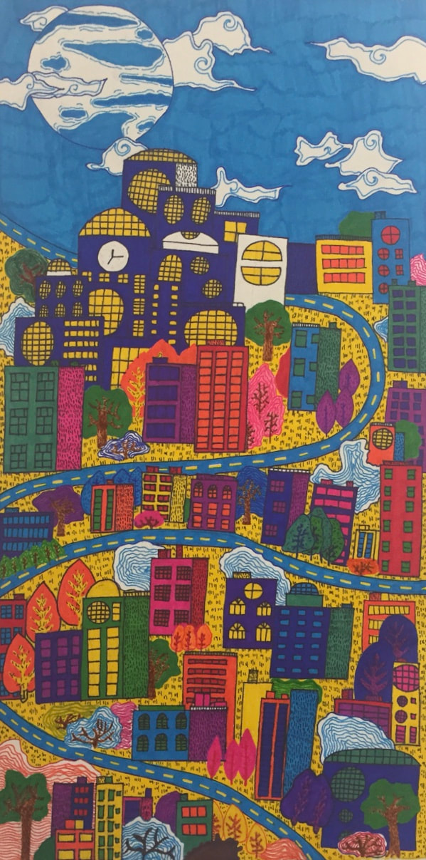
peice 7: not required
The first deficit I faced was the creating exactly straight lines, like the windows and detail within the buildings. I ended up changing my view on this a went for a not-so-perfect look. I then ran into another problem as I started to color in the buildings. Some of my markers wouldn't work on this paper because it was textured. I wanted the colors to be completely solid and very vibrant, so many of the markers I was using weren't opaque enough. This limited my palette, but in the end I was able to work with it. I was able to master the use of lines in my piece as that was a common theme in this piece. In addition I also mastered the use of unity with the winding street connecting every building.
I took inspiration from google images and found artists like Matt Gibson who created simple, yet colorful buildings. I created my own variation by combining many different elements in all of the pieces and combining them. I picked buildings like this because I wanted my drawing to have a certain look to it. A more cartoony, less realistic version.
I started off by using a pencil to trace out everything. After I decided to go in with a fine black marker and outline everything. I decided to do this before the color because I wanted to erase any pencil lines to before coloring which creates a more seamless, professional piece. After I outlines everything, I went in an added color. After this I added simple details such as the grass and road. Lastly I filled in the sky.
I would consider doing the sky differently. I don't like the marker lines and I wished I had picked a different color. I think the marker lines are very random as the rest of my piece does not have any marker lines. I would also consider doing the building cluster a different color because I'm not happy with how it looks.
This piece connects to my theme and my other pieces as it represents a large city. I will be going to college and I'm looking at big cities. College is very foreign and alien to me and something I am not familiar with. The people, atmosphere, and overall experience will be completely new to me.
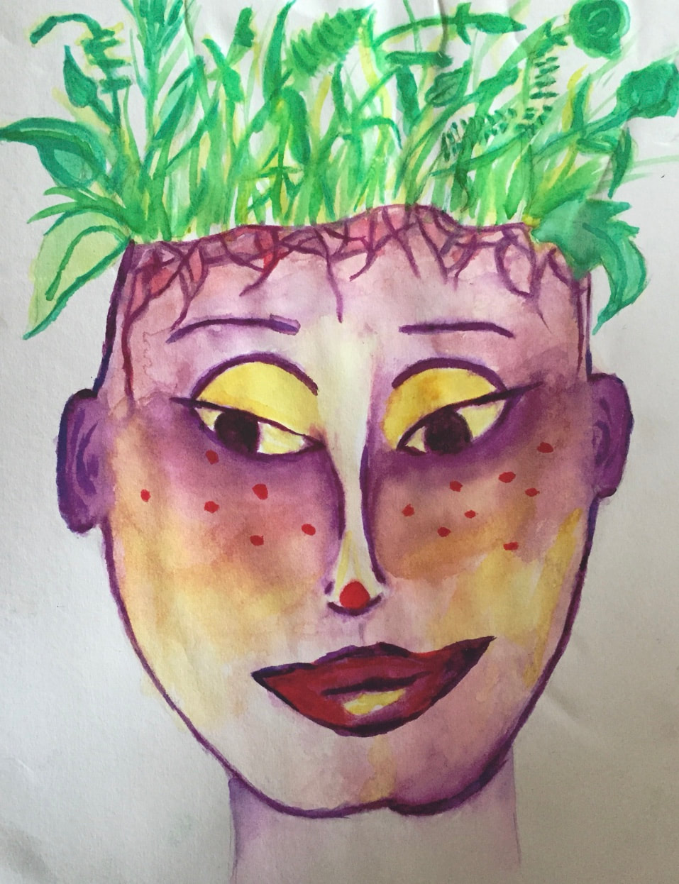
Piece 8: not required
The hardest part of this piece was the values. I wanted parts of it to be very dark and with a medium like watercolor it was very difficult. I ended up using way too much water and not being able to get the dark values I was looking for. Instead it came out a little muddy and messy which was not what I wanted. I was able to blend and create a gradient with the purple and yellow. In addition I used the balance within my piece as I used purple and yellow, opposite colors. By doing this the purple and yellow contrasted against each other creating balance while also establishing contrast.
For this piece, I decided to look at it a little bit different. Instead of going on google and finding art I really liked, I decided to draw from my own creativity and inspiration. Through this method, I created art that wasn't changed or altered by influencing pieces or art.
I first started by sketching the face, but at this point I hadn't decided to put leaves in for her hair. When I redrew the face, I decided to make her head look like it was cracked and leaves were growing out of it because it related more to the underlying meaning of this piece. I then started to use watercolor to first do the darkest parts. After using purple, I used the yellow and put it in the lightest pointf of her face. Lastly, I drew in the leaves.
Next time, I would consider using a different medium with watercolor. I really liked in my previous pieces how I included watercolor and acrylic. I think for this piece I could've done that and that would eliminate some of the messy looking problems I had. In addition, I would consider adding a 3d effect to this piece to create more dimension and depth. I'm not sure what the 3d effect could be but I think displaying this piece in a box frame would have created this depth.
This piece represents the portrayal of "alien" in relation to yourself. The leaves represent the inner growth inside that cannot be physical seen. Often times as we grow and change, we do not recognize ourselves from the past. This past self therefore turns into our inner "alien."
